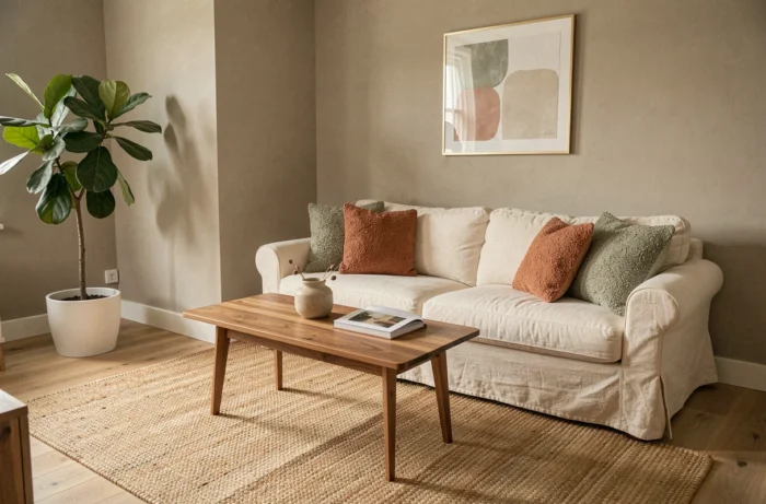
Interior decoration relies on a limited number of concrete levers: the color palette, materials, volume distribution, and furniture selection. Designing a stylish interior requires mastering these parameters before choosing a cushion or a light fixture. In recent years, palettes have shifted towards warmer tones and raw materials, redefining the visual grammar of the French home.
Color Palette in Interior Decoration: The Shift Towards Earthy Tones
The first parameter to establish before any furniture or textile purchase is the dominant color. The choice of hue influences the perception of space, apparent brightness, and coherence between rooms.
Since 2024, French palettes have evolved towards earthy tones such as terracotta, ochre, and clay. Deep greens (sage green, olive, forest) are also gaining strength, replacing the neutral grays that dominated the previous decade. This trend, documented until 2026, aligns with the search for natural and sustainable materials.
Online resources like homedream.fr allow exploration of color and furniture combinations to visualize these palettes in different types of rooms, from the living room to the kitchen.
The transition from a pearl gray wall to an ochre wall is not just a matter of taste. A warm tone absorbs light differently: it reduces the feeling of coldness in a north-facing room but can weigh down a poorly lit narrow space. The most reliable operational rule is to limit strong color to a single wall or alcove and keep lighter shades on the remaining surfaces.
Materials and Textures: How Wood and Stone Structure a Deco Style
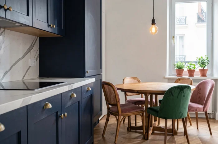
Color does not work alone. The dominant material of a room defines its style far more than a decorative accessory. A solid oak table top, a reconstituted stone countertop, or a terrazzo floor do not send the same visual signal.
Wood remains the most versatile material in interior design. Its appearance varies radically depending on the species (bleached oak, dark walnut, raw pine) and the finish (oiled, varnished, raw). For visual coherence, it’s best to limit to two different wood species per room.
Combining Textures Without Overloading the Space
The layering of textures adds depth to a room’s design. A linen sofa facing a raw wood coffee table and a wool rug creates three distinct tactile registers. Three textures are sufficient in a living room; beyond that, the effect becomes cluttered.
- Linen and washed cotton provide a relaxed look suitable for living areas and bedrooms. Their maintenance remains simple, which is as important as aesthetics.
- Stone (marble, slate, Burgundy stone) works in small touches: console tops, kitchen backsplashes, accent table tops. An excess of stone mineralizes the ambiance.
- Metal (brass, brushed steel, wrought iron) serves as punctuation. A brass light fixture or metal legs on furniture are enough to structure a space without cooling it down.
Arranging the Living Room Space: Volume, Circulation, and Furniture
The living room concentrates most layout errors because it combines several functions (rest, reception, sometimes work). The circulation between furniture determines the actual comfort of a room, far more than the style of the sofa.
The first piece of furniture to position is the sofa. Its size should leave a clear passage of at least one person’s width between each element. Placing the sofa against the wall frees up the center of the room but often creates an underutilized void. Positioning it in the middle of the room, facing away from the entrance, delineates a distinct living area without a partition.
Choosing Furniture Suitable for the Room’s Proportions
Furniture that is too large overwhelms a small living room. The height of the furniture matters as much as its width: low furniture (sideboard, coffee table, bench) visually elongates the space. High shelves, on the other hand, draw the eye upward and are suitable for narrow but high-ceilinged rooms.
The choice of storage elements also influences the perception of an interior. An open bookshelf wall gives a lived-in look, while closed storage (built-in closets, solid sideboards) cleans up the room. Both approaches work, but mixing them on the same wall creates a visual inconsistency.
Wall Decoration and Lighting: The Details That Change an Interior
The wall is the most visible surface in a room and is often the most neglected after painting. Two interventions transform a bare wall into a design element: indirect lighting and framing.
Well-distributed lighting avoids dependence on the central ceiling fixture, which flattens volumes and creates unsightly shadows. The layered approach works better: an ambient source (floor lamp, discreet string lights), a functional source (reading lamp, adjustable spotlight), and an accent source (wall sconce, picture lighting).
Frames, Mirrors, and Wall Treatments
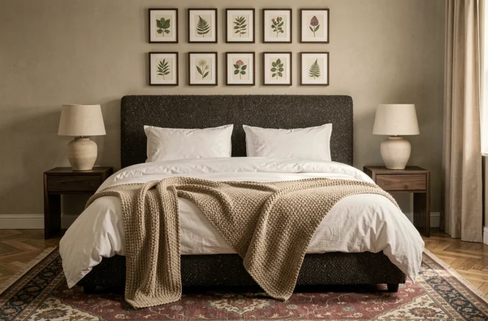
Hanging frames requires a minimum of method. The standard rule is to center the midpoint of the frame or group of frames at eye level. A mirror placed opposite a window redistributes natural light and visually enlarges the room, which remains the most effective solution for a dark or narrow space.
- A large rectangular mirror placed on the floor against a wall creates a depth effect without drilling. This solution is suitable for renters.
- Panoramic wallpaper, applied to a single wall, provides a focal point without overwhelming the room. Subtle botanical or geometric patterns remain the most visually enduring.
- Narrow wall shelves (like picture rails) allow for rotating frames and objects without multiplying holes in the wall.
The most sustainable decoration and layout choices are those that start from the structure of the room (light, volume, circulation) rather than a passing trend. A well-lit wall, quality material, and appropriately scaled furniture transcend styles effortlessly.